Extremely Contrasting That Feel Quite Quaint To Look At Palette Color Codes
858
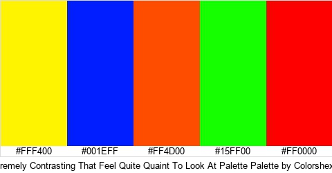
Extremely Contrasting That Feel Quite Quaint To Look At Palette is a palette in Logo category and belongs to Design Sub Category. Download the different hex colors of Extremely Contrasting That Feel Quite Quaint To Look At Palette. There are a total of 5 different colors which are #FFF400 #001EFF #FF4D00 #15FF00 #FF0000 . Find the color hex picture of Extremely Contrasting That Feel Quite Quaint To Look At Palette.
Tags
- contrasting
- tone
- look
- that
- feel
- extremely
- tactile property
- design
- quite
- quaint
- looking at
- sense
- passing
- feeling
- expression
- flavor
Extremely Contrasting That Feel Quite Quaint To Look At Palette Palette Colors
Extremely Contrasting That Feel Quite Quaint To Look At Palette Colors
FAQ
What are the different colors codes in Extremely Contrasting That Feel Quite Quaint To Look At Palette palette?
The Hex Color Codes in Extremely Contrasting That Feel Quite Quaint To Look At Palette are #FFF400 #001EFF #FF4D00 #15FF00 #FF0000 .
Which category does Extremely Contrasting That Feel Quite Quaint To Look At Palette palette belong to?
Extremely Contrasting That Feel Quite Quaint To Look At Palette belongs to Logo and Design Category.
This information was last updated on 04-09-2019.